
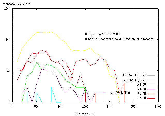
Does the distance for contacts change with time?
There's only enough data to analyse the AU opening on 50MHz and 144MHz.
The most noticable time-distance effect was seen on 50/PH and 144/CW
(these being the mode used for most contacts on these two bands).
Contacts for 50MHz/Ph fall into 2 groups
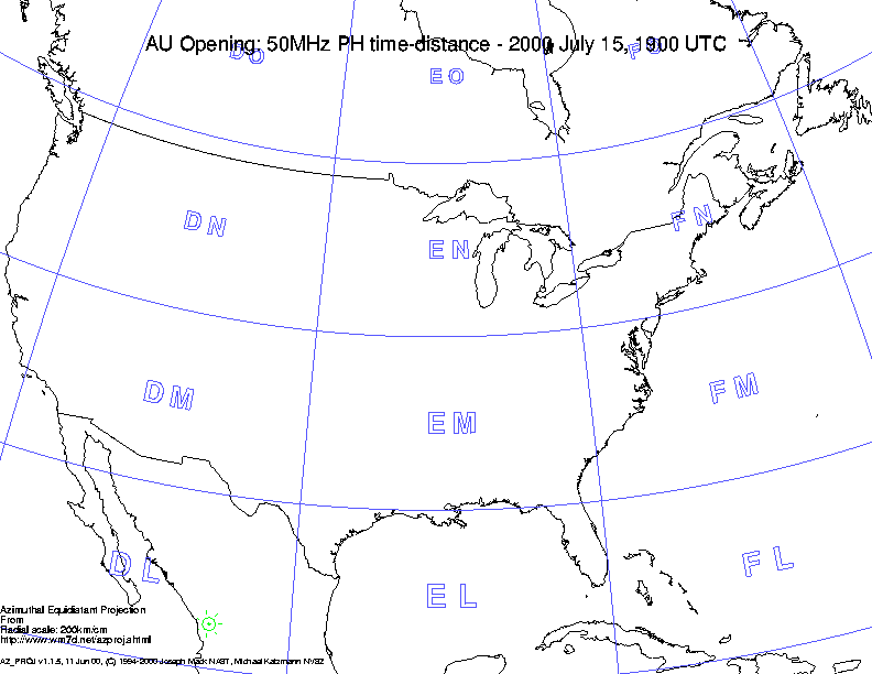
Here is an animated map of the 6m PH contacts
colored by QSO path length (all lines are great circles, which look straight
at this scale). Path length is indicated by color.
The long distance contacts (green, 100-2175km
and blue, >2175km) in the 2nd opening
are all from N1JEZ who said in his logs that all his contacts were Es (non-aurora).
Although it is possible that other non-aurora (Es) contacts are in the logs,
eleminating N1JEZ's contacts (all known to be Es)
from the 6m PH logs should give a better picture of the AU opening.
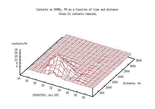
Here's the time-distance map without the contacts of N1JEZ.
There is now very few long contacts on 6m phone, but the opening at 2800-3000
(i.e.0400-0600 16 Jul) is clearer.
Here's the animated map for 6m (all modes), without the Es contacts from N1JEZ.
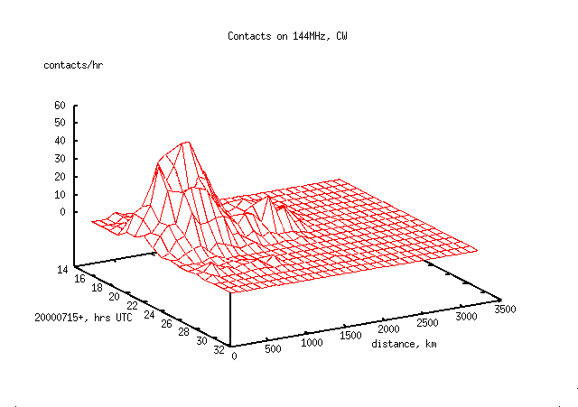
Contacts for 144MHz/PH fall into 3 groups
It is possible that the island of long distance
contacts is an artifact of the non-verifiable gridlocators
of 28% of the operators. To test this, here is the data again
using only QSO's with verifiable gridlocators.
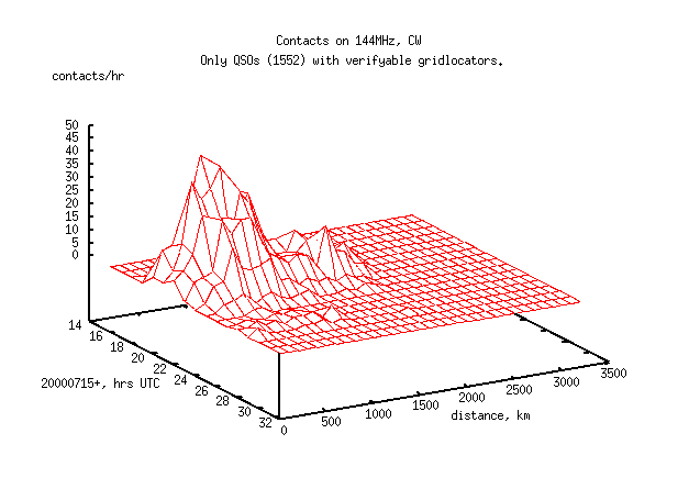
The second island of contacts in the distance range 1100-2175km persists,
indicating that it isn't an artifact
caused by including QSOs with unverifyable (and possibly incorrect) gridlocators.
Why are there 2 groups of contacts (and why only on CW)? Here's the animated
map for these contacts. See if you can see any difference between the
shorter red (0-500km)/yellow(500-110km)
contacts on one hand and the longer
green(100-2175km)/blue(>2175km)
contacts on the other.
Although it wasn't obvious to me, many of the audience at the NEWS talk
shouted out that the longer contacts were east-west (E-W)
rather than north-south (N-S).
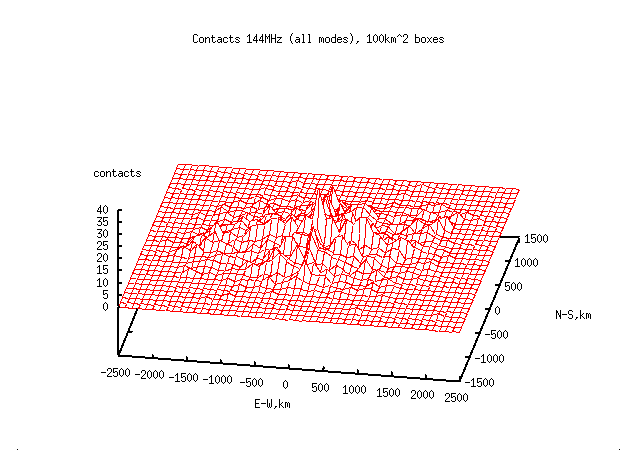
Here is the bearing-distance data is for 144MHZ, both modes (1739 contacts).
This was plotted from the bearing and distance at both ends of the QSO, calculated
for the great circle path (since we don't have the headings at each end).
Each QSO is represented twice, one for each end of the
QSO. The height on the Z axis is halved to compensate.
Contacts are either on a N-S line for short distances, or
to the N.E. or S.W. (following the population distribution
on the east coast of USA) for longer distances. The E-W tendency
is the classic pattern for AU, but the NE-SW population distribution
on the east coast appears to dominate.
The E-W effect can be seen in the 50 and 222MHz data but is not as pronounced.
Here's the animation for 2m (all modes) for the short (<1100km)
contacts with contacts marked by direction;
N-S and E-W.
This data shows that short contacts have no directional preferance.
Here's the animated data for the long (>= 1100km) 2m contacts
It's clear that the long contacts are (nearly) all E-W. This data
can't tell whether the E-W effect is due to the E-W distribution of
population, or due to better propagation by the aurora in the E-W direction.
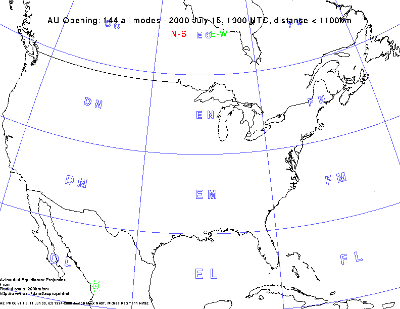
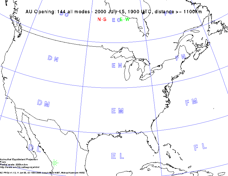
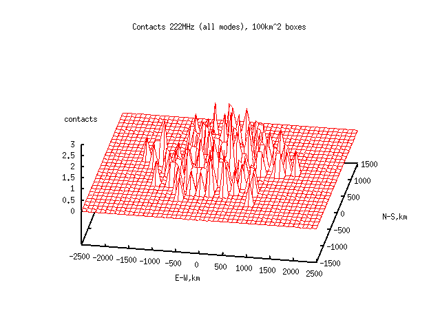
Here's the location of hams at the other end of the QSO relative
to you for 222MHz.
There is a slight E-W effect on 222MHz.
(C) Joseph Mack 2000-2002, Joe NA3T, jmack (at) wm7d (dot) net, http://www.wm7d.net/azproj.shtml
Previous
Next
Table of Contents
Time-Distance 50MHz/PH, 452 contacts
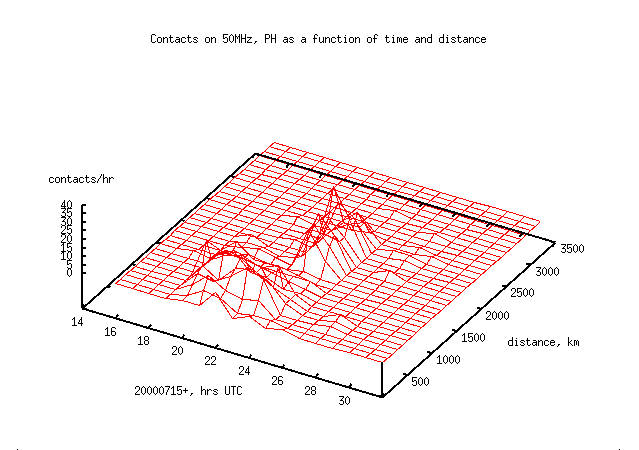
This 2nd opening happens in the last 2hrs of the first opening, and
has a comparable number of contacts/hr.
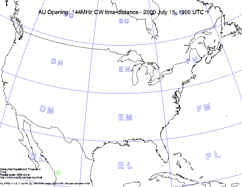
Time-Distance 144MHz/CW, 1663 contacts
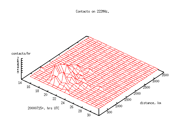
Time-Distance 222MHz, all modes, 117 contacts
There's not a lot of contacts on 222MHz. However the data appears to
be one group, unlike the data with 50 and 144Mhz.